
Zenith is built with a responsive layout, which means it automatically adapts to the viewing device.
Zenith will expand and contract accordingly to the size and resolution of the screen, whether mobile, tablet or desktop.
Zenith is built with a responsive layout, which means it automatically adapts to the viewing device.
Zenith will expand and contract accordingly to the size and resolution of the screen, whether mobile, tablet or desktop.
Took me a long time to learn this lesson, but now that I’ve learned it, I can’t even remember what it was like to feel
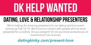
The Kinky Dating Something Something and Love Blah, Blah, Blah event is coming up Valentine’s Weekend, and we’re already got a few hundred people interested

People often ask me if they can play with or date my partner. Which is nice. And I appreciate the connection and the consideration. However,
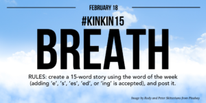
The word of the week is “breath”. To participate, create a 15-word story with breath, breathe, breaths, breathes, breathed, or breathing. I can’t wait to

Laughter ensued. I did a slow blink. I paused. And I shook my head. The group of people I had just joined laughed even harder.
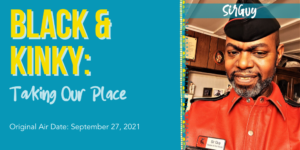
On September 27, 2021, SirGuy presented the topic ‘Misconceptions of Dark-Skinned Men In & Out of the Fetish Scene’ for Dating Kinky’s Distinctions of Deviation
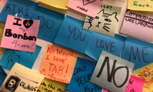
I was out Thursday night with friends at a new rolled ice cream place that encourages patrons to create post-it notes for the wall, and
What is protocol and why do you need it? Not all protocol is bowing and kneeling and “yes, Sir,” and so on. Protocol can be