
Zenith is built with a responsive layout, which means it automatically adapts to the viewing device.
Zenith will expand and contract accordingly to the size and resolution of the screen, whether mobile, tablet or desktop.

Zenith is built with a responsive layout, which means it automatically adapts to the viewing device.
Zenith will expand and contract accordingly to the size and resolution of the screen, whether mobile, tablet or desktop.
“Indeed, in many respects, she was quite English, and was an excellent example of the fact that we have really everything in common with America

Most people see trust as what others do. I don’t. At least not most of it. Maybe 1%, maybe 10%, to me, is what people

I’ve been writing about selfishness for a long time. I’m a damned selfish person. I know this about myself. I wrote “I’m a Selfish Shit”

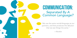
A friend of mine posted this image about a year ago on FB: It confused a lot of people. And I understand the confusion.

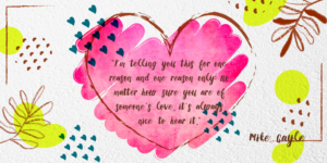
31 years ago, I began a tradition. For my birthday, I get myself one meaningful gift every year. My nickname, Nookie, came from that first

This weekend, I was at a costume party, in conversation with some friends, when one said (I’m paraphrasing), “I don’t always agree with what you
In a good relationship, you feel loved, secure, significant…and so many other things. In a GREAT relationship, you’ll have all that AND you will get
I got a message this morning (before I even looked at my scheduled writing for today), and frankly, it hit a nerve. I’ve seen WAYYYY