
Zenith is built with a responsive layout, which means it automatically adapts to the viewing device.
Zenith will expand and contract accordingly to the size and resolution of the screen, whether mobile, tablet or desktop.
Zenith is built with a responsive layout, which means it automatically adapts to the viewing device.
Zenith will expand and contract accordingly to the size and resolution of the screen, whether mobile, tablet or desktop.

What I write is not proclamations of the WON TWOO WAY, or even the statement that I think you must or should do something. I

A bit ago, I shared an article on my social media titled Woman Who “Broke” Her Vagina With Sex Toy Shares Warning To Others. (Clicking

Valentine’s Day can seem sort of trite and commercial. In fact, my partner and I don’t celebrate it. Given the right opportunity, my partner has

My whole life, I’ve been a doer. I’ve taken the road less traveled, I’ve gone out and experienced things. I’ve really LIVED. One of my

CW: How I have learned more about racism through my experience of language as a white child and as a woman. — When I was
Do you know why I do what I do? At the heart of it all is because I believe the world is a better place
I don’t agree that Summer is the best season. I don’t agree that cats are better than dogs. I don’t agree that God/s exists. Or
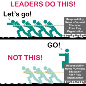
A. Weaknesses, fuck-ups, stupidity (at least temporarily), inappropriate reactions, hypocrisy, and pretty much everything else associated with greater humanity. Yup. Lifestyle leaders are human. Like